GoAdventa
A start up dedicated to helping people get outside and make the outdoors more accessible, in need of an updated and more usable website.
Role | UXUI Designer
Client |GoAdventa
Tools | Figma, Lyssna, Google Suite
OVERVIEW
Background
GoAdventa is a small woman-owned company dedicated to helping people get outside and make the outdoors more accessible. Starting as consulting and training organization focused on helping schools start their own outdoor programs, their operations evolved into the development of a trip planning web based application.
Problem
GoAdventa's website content does not align with current business goals. The home page does not highlight the key service (the Trip Planner) that GoAdventa offers. Additionally, lack of cohesive branding and usability issues within the site prevents users from quickly building trust.

RESEARCH
Methods
I landed on three types of research based on the client's needs. I immediately identified severable usability issues on the current website which led me to a usability analysis. From my scoping call with the client, I also learned that their business goals were different than what the current website prioritized, which led me to stakeholder interviews. Since I only had time for one set of interviews, I prioritized stakeholder interviews over user interviews in order to more deeply understand business goals and the type of user the founders wanted to attract. Finally, I completed a competitor analysis to understand the current market of outdoor focused applications.
Usability
Analysis
Comprehensive review of usability to seek out areas for improvement and to help client understand value of UX.
See File
Stakeholder Interviews
Interviewed each founder to understand current challenges, business goals, and future priorities. This informed content prioritization and goals of homepage.
Competitor Analysis
Answering the question: what is unique about GoAdventa's trip planner tool in the context of the current market?
See File
Synthesis
Want to see the behind the scenes and how I discovered insights? Take a deeper dive into my research synthesis process by exploring the affinity map.
Explore


Findings
Outdated content does not speak to current business goals or highlight primary service GoAventa is offering
Broken links, challenging usability, and lack of cohesive branding prevents user from quickly building trust in GoAdventa's offering
Unclear who the target users are for GoAdventa based on website layout and copy
INSIGHTS
User Archetypes
The Trip Planner was originally designed for institutions, but works equally well for individuals. The founders recognized that individual users made up a bigger part of the outdoor industry and would be better for gaining traction in the early stages of their new business goals. I created user archetypes that centered both individual and organizational users.
New Hiker
Core Needs
The new hiker has explored several or many trails close to home. They have only done trips that can be completed in a day. They really enjoy hiking and want to plan a trip that includes an overnight or two. They have talked to a few friends who have done overnight trips and have read some blogs about trip reports, but is having a hard time figuring out where to go.
Pain Points
Hard to know where to start with what gear they need
Have never cooked outside and so don’t know what meals would be easy to cook
Finds searching for camping areas on the internet overwhelming
Experienced Friend
Core Needs
The experienced friend wants to bring her group of friends into the mountains for a backpacking trip. As the most experienced person in the group, she is looking for a way to easily organize meals, make a packing list for her friends to use, and plan where to go and camp. She needs an easy way to organize all this information in one place.
Pain Points
As the most experienced backpacker in the group a lot falls on her to plan the trip and make sure her friends have what they need
She has gone on her own backpacking trips with other experienced people but hasn’t been on a trip with people less experienced than her
Teacher Starting Outdoor Program
Core Needs
A teacher at middle school has read about the benefits of being outside and wants to bring their students on a day hike and perhaps an overnight camping trip. The teacher has been hiking and is comfortable in the outdoors, but knows that it's different to take kids outside. The school has limited resources and training funds available.
Pain Points
Needs a centralized place to plan the trip where they can plan the itinerary, meals, and gear needed
Has never planned meals for a large group camping before
Needs a way to organize information about and communicate to students what gear to bring
University Outdoor Program Director
Core Needs
The University Outdoor Program Director has an established program and is looking for a way to build out trip options for student led trips. Ideally students are able to plan a trip with minimal support from staff once they have been through a trip leader training program.
Pain Points
University has a small program staff for a lot of different trip options
Current file systems means information about each trip is in several different documents and resources
Students have a hard time planning trips on their own or with minimal support due to the file system
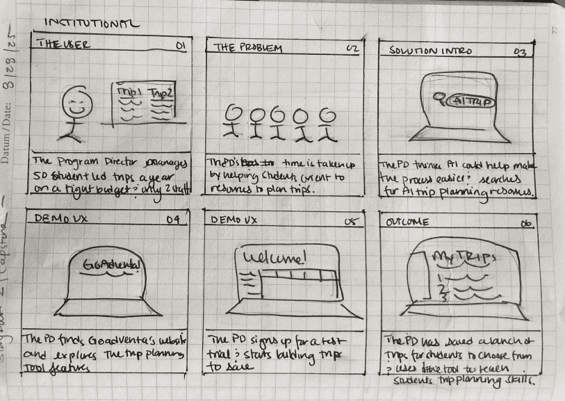
Storyboard
I used story boards to work out how different types of users archetypes would find GoAdventa and how the Trip Planner would meet their needs.

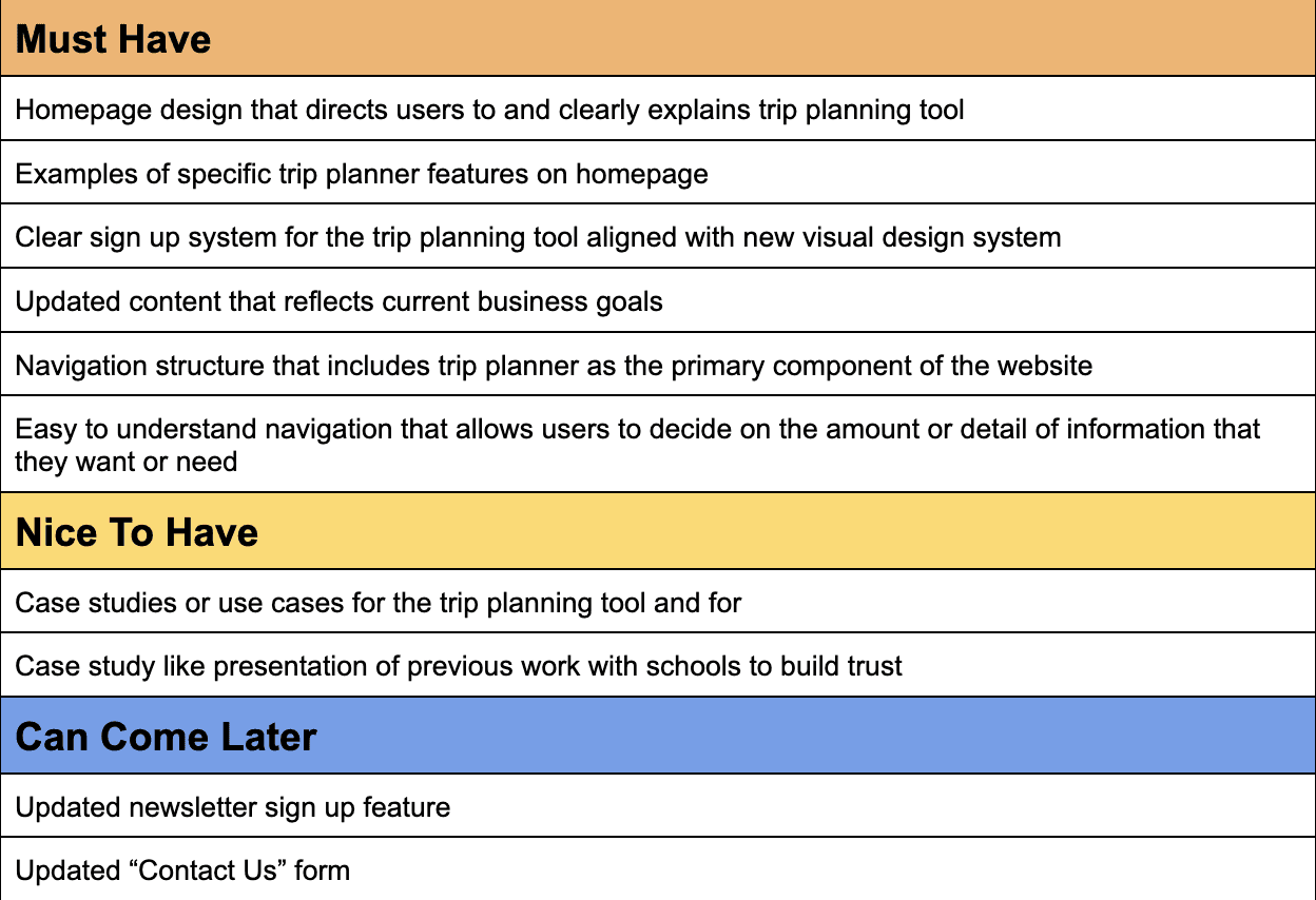
Prioritization
I prioritized features that would make the most impact towards business and user goals, developed from the research phase.
EXPLORATION
Site Map
I prioritized simple top navigation to funnel user toward the trip planning tool and used footer navigation links to direct user to auxiliary functions and services. I determined top navigational links based on overlaps between business goals and user goals.
Tree Testing
In order to test the current site map, I conducted tree testing. This helped validate some decisions and made us update others. I replaced "Services" in the top navigation with "Sign Up" in order to better direct users and added a drop down menu to the account button.
Further Iteration
Usability testing provided more opportunity to refine the site map, adding "Log In" to the top navigation and changing the account link from a dropdown to a link to an account page.

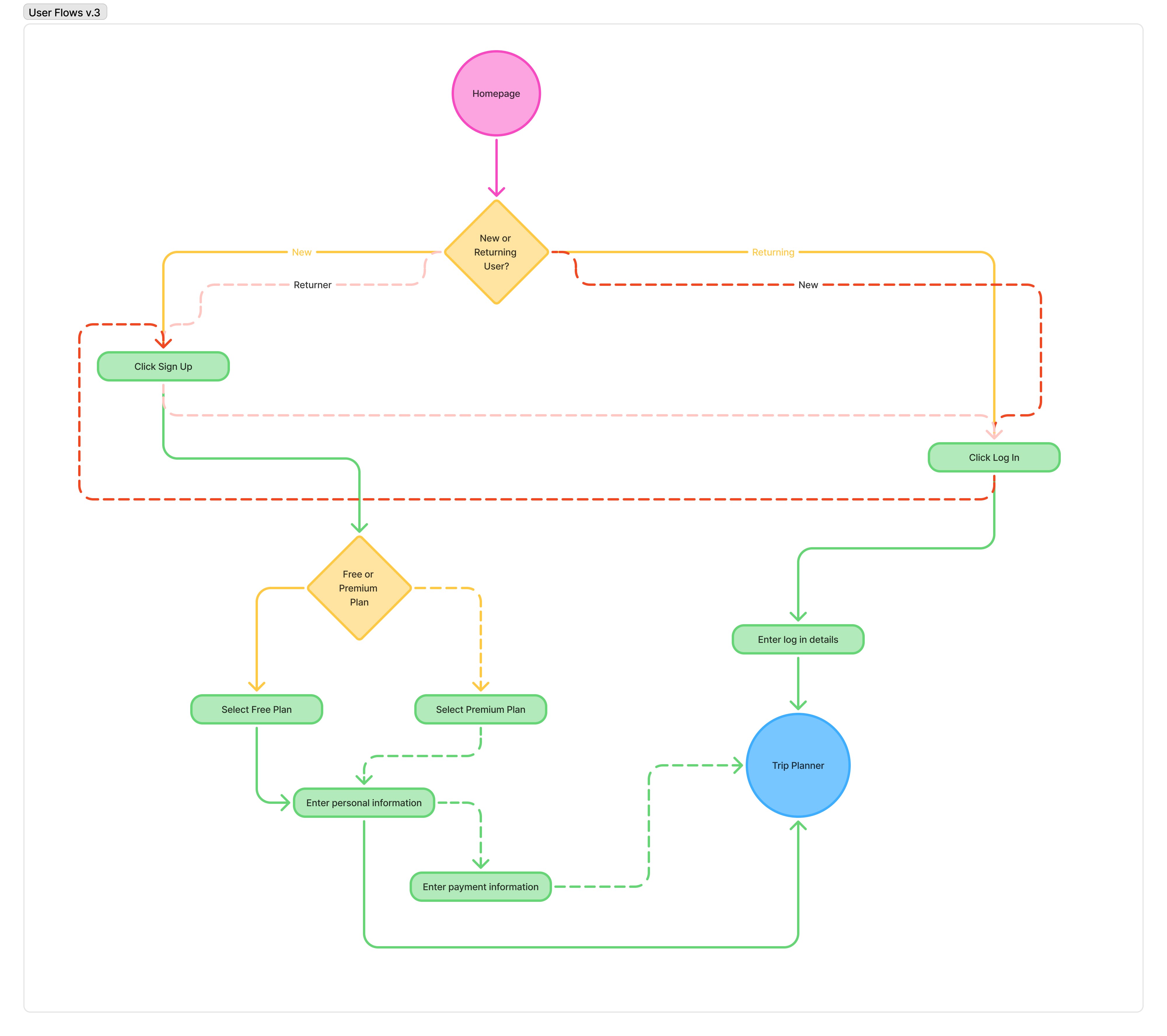
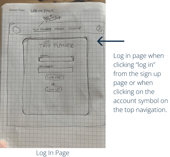
Task Flows and User Flows
I prioritized sign up and log in task flows since one of the primary goals of the redesign was to get users to sign up for the Trip Planner. From there, I developed user flows.
How might we communicate the versatility and applicability of the trip planning tool to users and guide users to the trip planning tool more quickly in the browsing process?
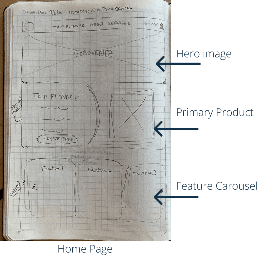
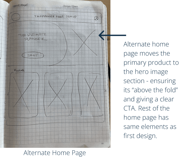
Low Fidelity Wireframes
Quick sketches to both test layouts and experiment with different designs for cards throughout the website.These allowed me to try different styles quickly and easily.


Mid Fidelity Wireframes
I built mid fidelity wireframes to continue iterating on my designs while I was developing branding elements with the client. This allowed the project to continue moving forward without rushing the clients on their decision making with colors and typography.
PROTOTYPING
Colors and Typeface
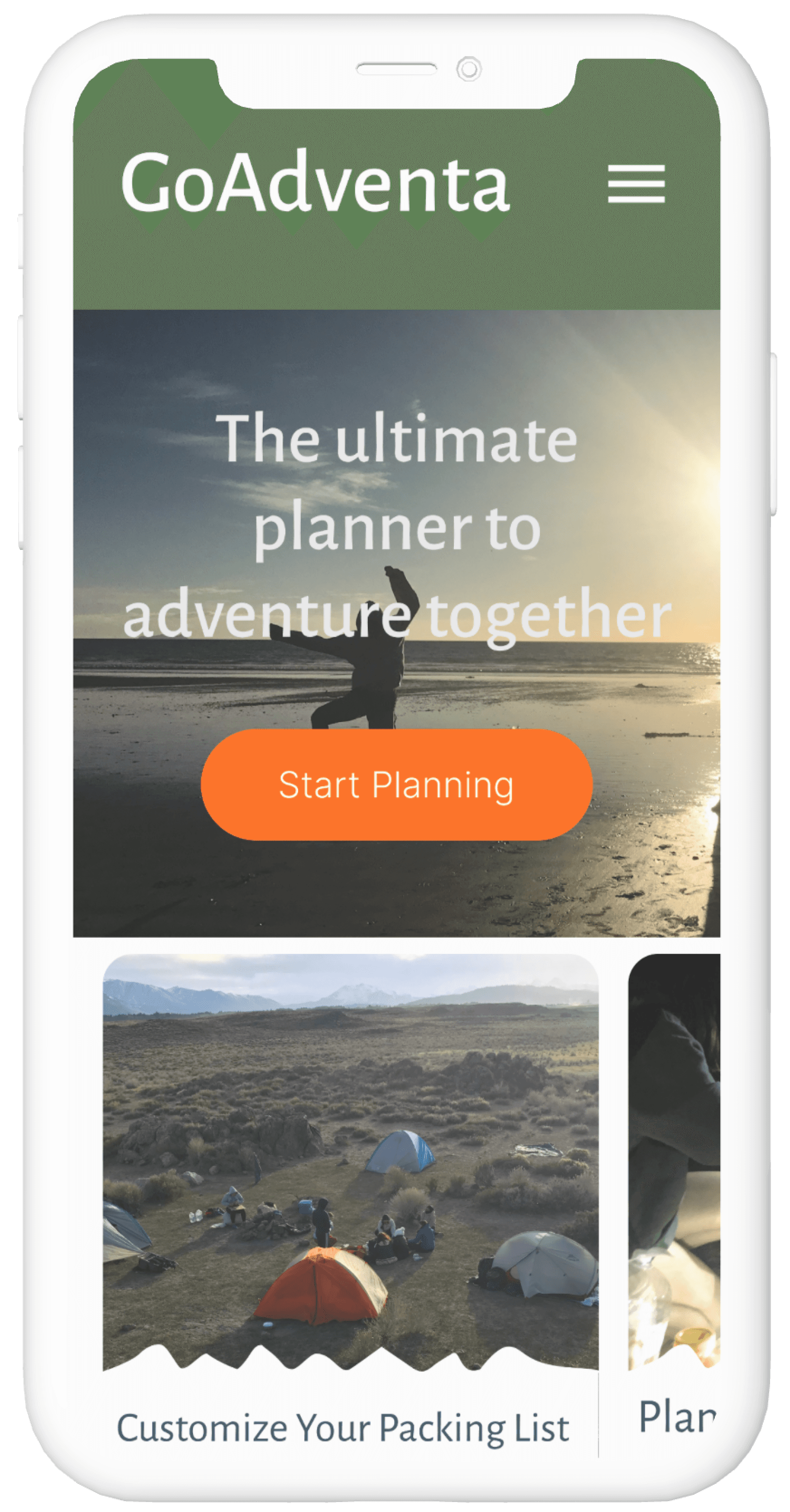
I developed branding for GoAdventa's website to match the new direction the founders wanted to take with the organization and the brand values of adventure, joy, calm, accessible, and organized. I gravitated towards the earthy tones such as greens and blues, but also used an orange for specific interface elements to draw attention to CTAs and to create a sense of adventure and joy.

Logo and Images
The clients wanted to keep their logo design, but the colors needed to change to match the new colors. I updated the logo colors and provided a variety of options for the client to us.
Images were chosen to evoke a sense of adventure and joy in the outdoors. The photos came from the client's own collection.


Components
I applied the typeface and color styles to components that I used throughout the design.
USABILITY TESTING
Plan and Method
I developed two scenarios and conducted remote unmoderated testing using the Lyssna platform.
Usability testing revealed several key issues with the sign up and log in flows and results allowed me to rework these to better support the user and provide clarity.


What testers had to say…
"The signup process is simple, the only thing missing is the payment method, but I would have started with the free account."
" [I] did not find log in link at first, beside that everything seems clear."
"The processes are not complex and the web design is very nice and easy to understand. The details have just enough information to start with and sign up and login process are easy too."
Results
Scenario 1: Sign Up
For the first scenario, all users made it to the logged in dashboard screen. However, two users got there through the log in flow. The three users who went through the Sign Up flow clicked on the “Start Planning” and the two that ended up going through the Log In flow clicked on “Trip Planner” first. None of the testers clicked on “Sign Up”.
Actual Completion Rate: 60%
Average Time to Complete: 75 seconds
Scenario 2: Log In
In the second scenario, all users also made it to the correct final screen. Two users, however, went through the sign up process, instead of the log in process, to get there. Of the users that went through the log in process, one navigated to the log in page with one click and two users navigated to the log in page through the log in link on the initial sign up page
Actual Completion Rate: 60%
Average Time to Complete: 32 seconds
Iterations
The iterations included the following items:
Easier to find log in button on home page
Add google login option to log in page
Take out photo upload (add as option to future profile page)
Add payment screen for premium subscription option
FINAL PROTOTYPE
Reflections
Project Reflection
This project provided experience working with a real client from start to finish, navigating the full design process from stakeholder interviews through final high fidelity mockups and prototype. I worked with a simpler component system than previous projects, but one that still supported efficient iteration and incorporated a variety of common design patterns.
Working with a Real Client
Having business goals tied to a real client was incredibly helpful and grounded the design work in tangible outcomes. The most significant learning was about client communication, specifically what information is helpful to share versus too much information and planning enough time in my timeline for client feedback cycles.
Branding work with this client was particularly challenging and revealed areas where my skills need development. I recognize that I need and want more practice in this area to feel more confident in future branding projects.
Research & Design Process
I found the research and synthesis phases more approachable because I've done similar work before, and those phases moved faster and more smoothly as a result. I intentionally structured this project to experiment with an unmoderated usability test conducted through an online platform. This approach was incredibly efficient and really made me consider what I needed to know given time and financial constraints—forcing me to prioritize the most important questions.
Component libraries proved super helpful for iterations, allowing me to make changes efficiently across multiple screens. While there are several more screens and pages for the actual website still to design, I focused on the key user flows that would get people to start using the tool.
Outcomes
The original website for this client did not reflect current business goals—it was outdated and lacked simple usability principles. My goal was to make a meaningful difference in the usability and design of the website, and seeing the high-fidelity mockups come together was genuinely rewarding. The redesigned site now aligns with the client's current direction and provides users with a more intuitive, functional experience.
CASE STUDIES
lones.amy@gmail.com
2026
Amy Lones