NOLS
End to end internal mobile application for a global wilderness school, providing digital field documentation capabilities.
Role | UXUI Designer
Client |NOLS
Tools | Figma, Lyssna, Google Suite
OVERVIEW
Background
NOLS maintains over 500 active instructor who work in a variety of environments and skill types. All instructors must provide course documentation for each course. Currently, all field documentation is analog and many of these documents are digitized once courses return from the field through scanning and manual input and paper copies are sent to a variety of departments.
Digitizing course documentation takes a significant amount of time and there are seasons where information is not digitized or there are errors, leading to loss of information. Lack of information means that its hard to identify patterns in feedback and make relevant and timely improvements.
Problem
NOLS instructors currently lack a single field-ready digital documentation system that balances ease of use with organizational needs. Current digital approaches require multiple apps, lack standardization, and present editing challenges especially on mobile devices. This inconsistency creates barriers to data synthesis, delays feedback loops, and prevents NOLS from fully using documentation to improve programs systematically.
RESEARCH
Methods
The research phase consisted of in person and remote user and stakeholder interviews as well as a competitive analysis.
Interviews
Goal: understand benefits and challenges of current digital and analog documentation processes
6 user interviews
1 stakeholder interview
Competitor Analysis
Internal tool analysis of current market identifying:
Whether they met organizational needs.
Common design patterns to adapt to NOLS specific needs.
Synthesis
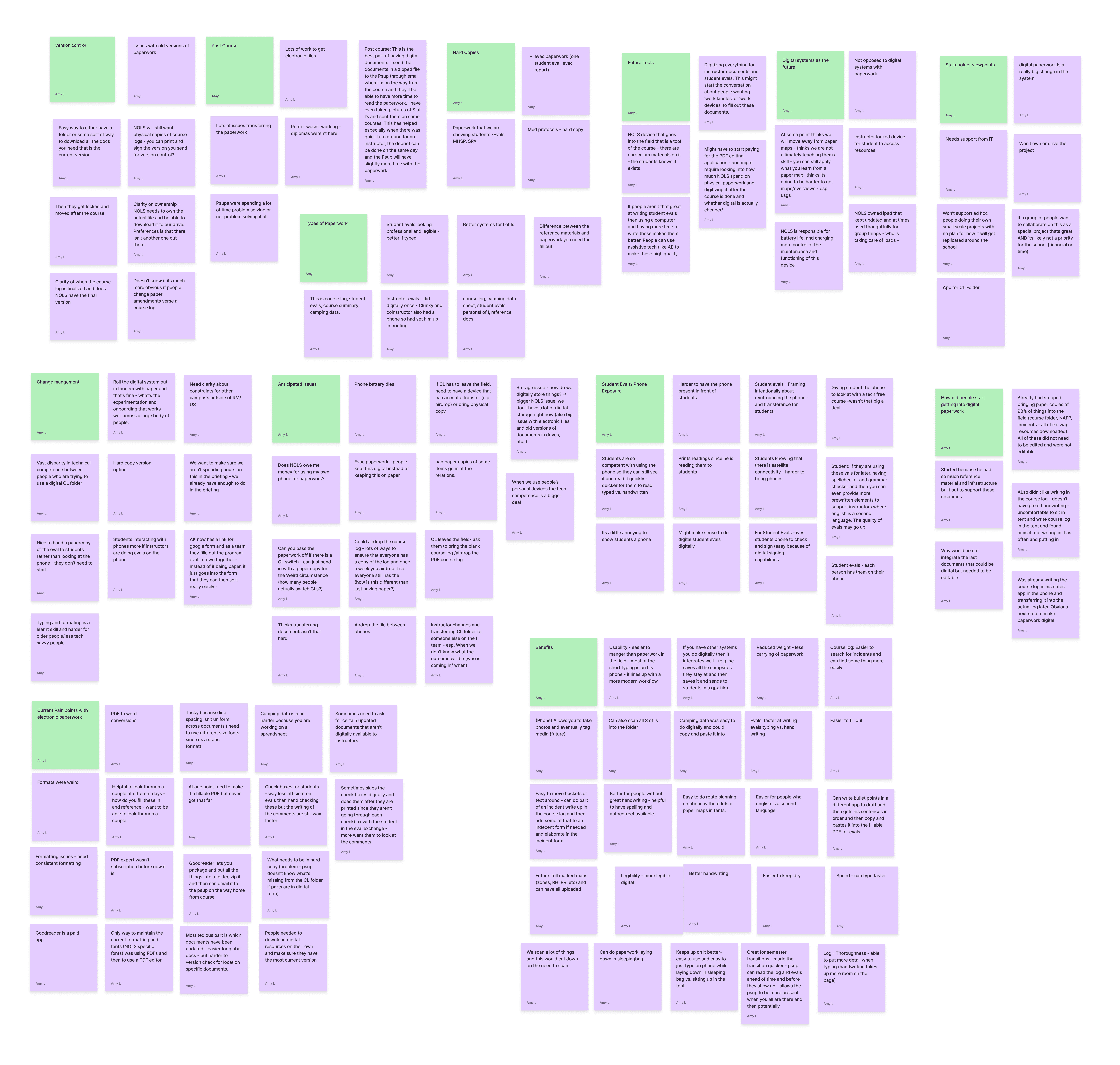
Synthesis
Findings
Current adhoc digital systems requires two apps (one for storing files and one for editing) and editing PDFs to maintain document formatting - especially challenging on a phone sized screen.
Hard to know what resources and reference documents have been updated since last upload and some digital documents are not readily available to instructors
Some instructors have hard to read handwriting, speak/write english as a second language, or have a learning difference that makes handwriting harder.
INSIGHTS
User Archetypes
I developed user archetypes versus personas because I find it most helpful to focus on specific user behaviors and core needs. Drawing from user research, the behaviors and core needs help me keep in mind real and potential pain points for users and how interconnected they are with the problem statement.
Experimenters
Core Needs
Wants to use technology to innovate work systems
Needs to have pipeline to give feedback and opinions
Ways to talk with others who are also experimenting to learn from each other.
Behaviors
Initiates experimentation of new systems or workflows
Shares with others what they are learning the system they have developed
Contributes to global knowledge at the school and moves the school’s thinking forward
Free Agents
Core Needs
Wants to come into a built system, but doesn’t need it to meet all needs to try it
New system needs to attend to some sort of individual pain point or make some part of their work significantly easier.
Behaviors
Adopts new but tested systems and is willing to engage in feedback on how to make it better.
Adoption is driven by making a part of their work life easier.
Traditionalist
Core Needs
Has been in field for a long time and that continues to be a key part of their life
Likes systems and wants them generally to be simple and familiar
Connection to the school and mission has what kept them around for so long and they need to continue to feel that connection.
Behaviors
Has a specific way they learned to do something and has done it that way for a long time.
At the point where change is harder - they have not reexamined their systems in a while.
Open to new ideas but sometimes not aware of the need to iterate or that systems have changed.
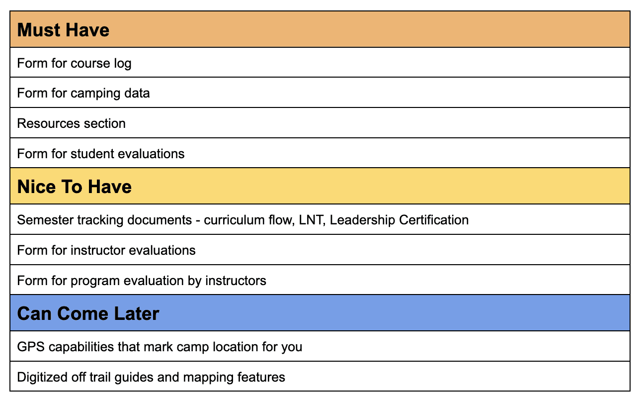
Prioritization
Based on information gathered in the research phase, I developed a list of features, prioritized features that instructors would use the most, (the course log and resources), as well as documentation that had the most manual input (camping data and student evaluations).
Features tin the "Can Come Later" category served as a holding place for exciting future features that would require more significant organizational culture shifts.
EXPLORATION
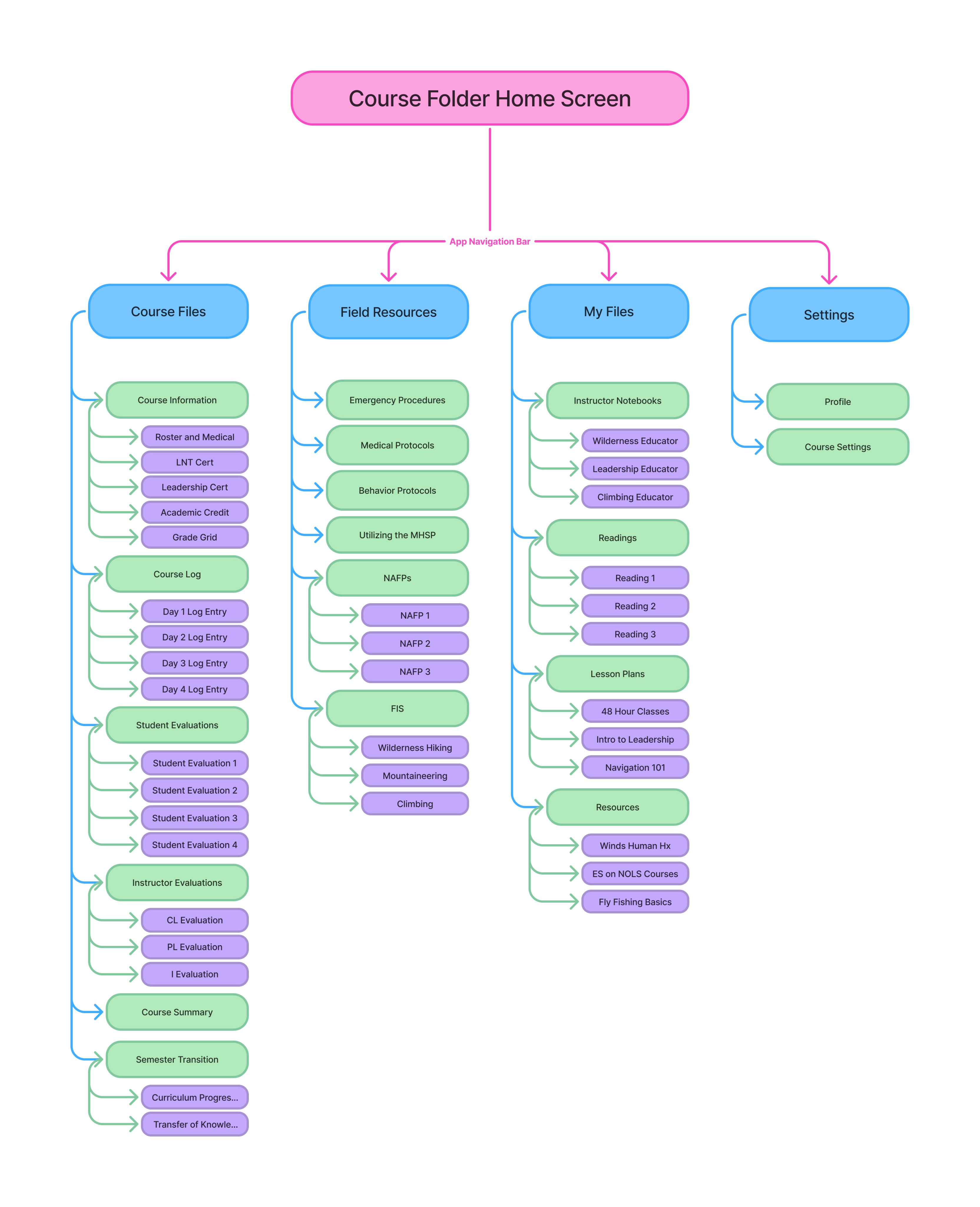
Site Map
I developed a site map to help me better understand the flow of information. The site map balanced the need for systems to feel familiar to gain buy in with key innovations that made a noticeable difference in usability to users.
Familiar: File based system
Innovation: combining several analog documents to make data gathering easier. This included:
Removing an individual "Camping Data" file and adding a field into the course log entry form as well as
Removing the Health Info doc and adding a field to the roster.
The site map echoed current instructor systems for organizing paperwork with Course Files holding forms for documentation that instructors interact with more readily, while Field Resources and My Files hold different types of reference documents used for risk and course management and teaching.
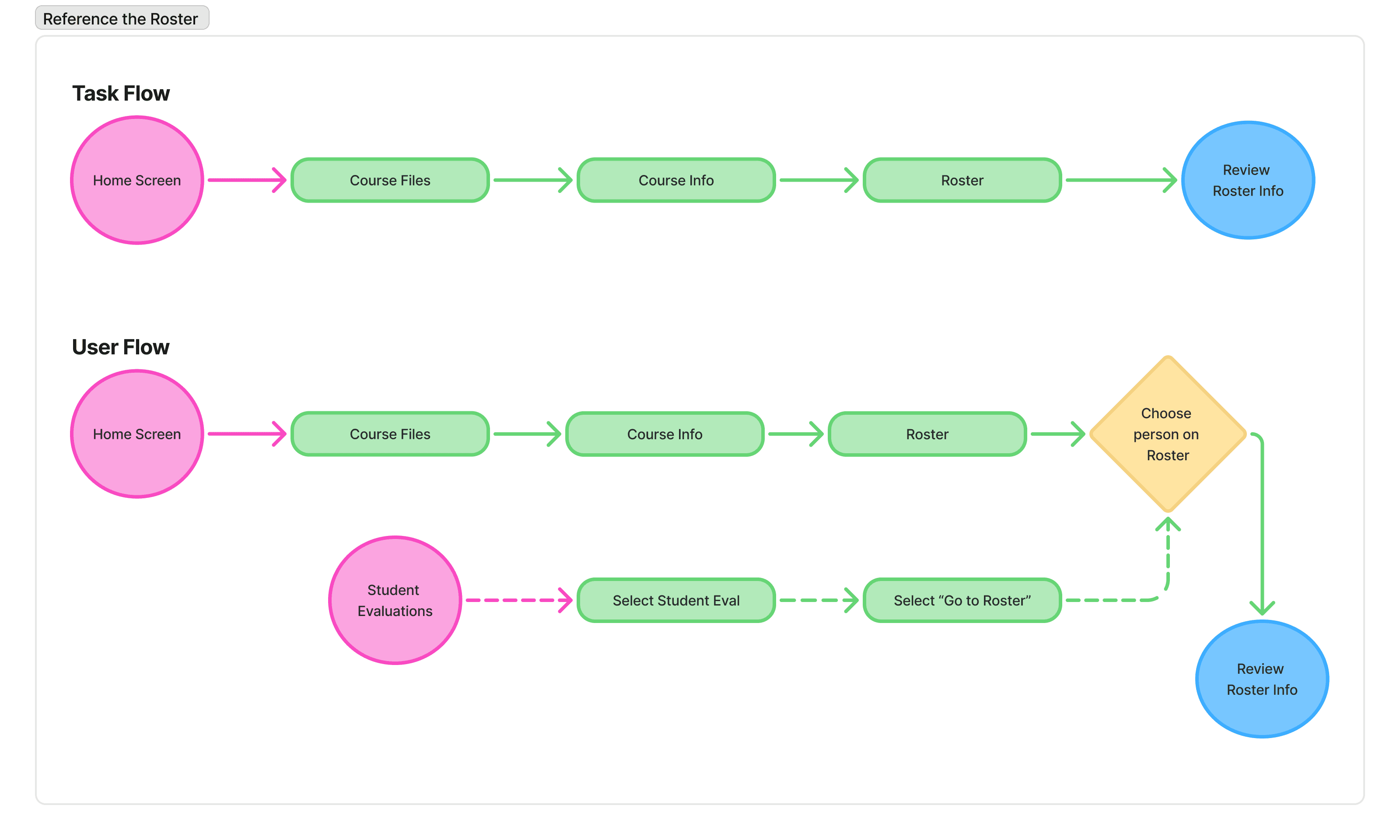
Task Flows and User Flows
I prioritized task flows that aligned with must have features, thinking both about what primary user challenges I was solving for and the future usability testing. I wanted to make sure the flows I tested aligned with user needs. I started with task flows and used them as a basis to develop user flows.
How might we develop a consistent and easy to use system that meets the needs of all architects, ensure consistent digital field documentation across the school, and use digital field documentation to increase ease of data collection and synthesis and therefore increase pace of iteration and innovation in other school systems?
Low Fidelity Wireframes
Low fidelity wire frames were developed based on user and task flows in order to test the highest priority features. My background in drawing and printmaking explains my preference for hand sketching wireframes first. I think by drawing and found that sketching comprehensive low fidelity wireframes of key screens made the rest of the process more efficient.
Click through to see the low fidelity wireframes.


PROTOTYPING
Interface Design
NOLS already has clear brand guidelines primarily developed for print publications. I reviewed color, typography and logo to evaluate what colors would transfer well into a digital space by meeting WCAG accessibility guidelines and how to distinguish the app as an internal tool versus an external facing marketing asset.
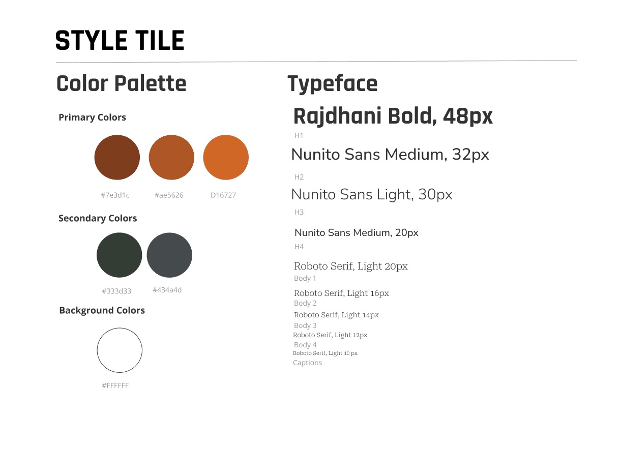
Color and Typography
As an outdoor organization, NOLS has earthy colors. In order to maintain WCAG contrast standards I prioritized using the darker colors in their color palette and kept the design simple. I replaced the standard brighter orange (mud) with the darker rust color. I used the gray (rock) for text and the green (forest) for buttons.
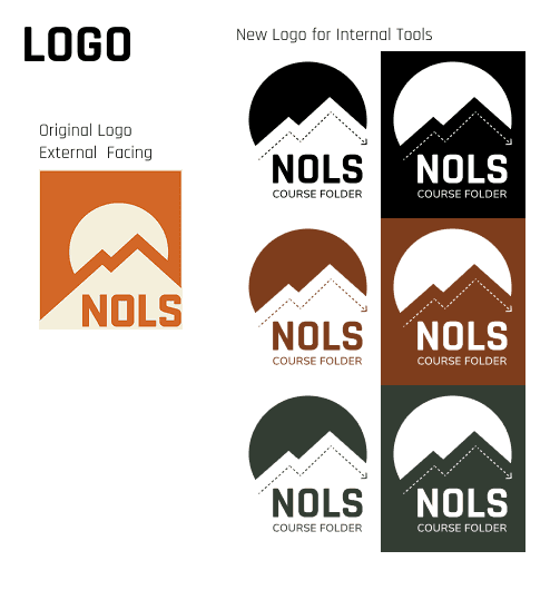
Logo
I adapted the NOLS logo to internal use and added a playful dashed line mimicking how trails are depicted on topographic maps. I made the sun a bit bigger so that it served as a container for the logo without the square border of the original logo. Adding “Course Folder” mimics location specific logos for NOLS. The specificity of adding “Course Folder” shows care and attention to instructor needs by designing a logo adaptation just for them.

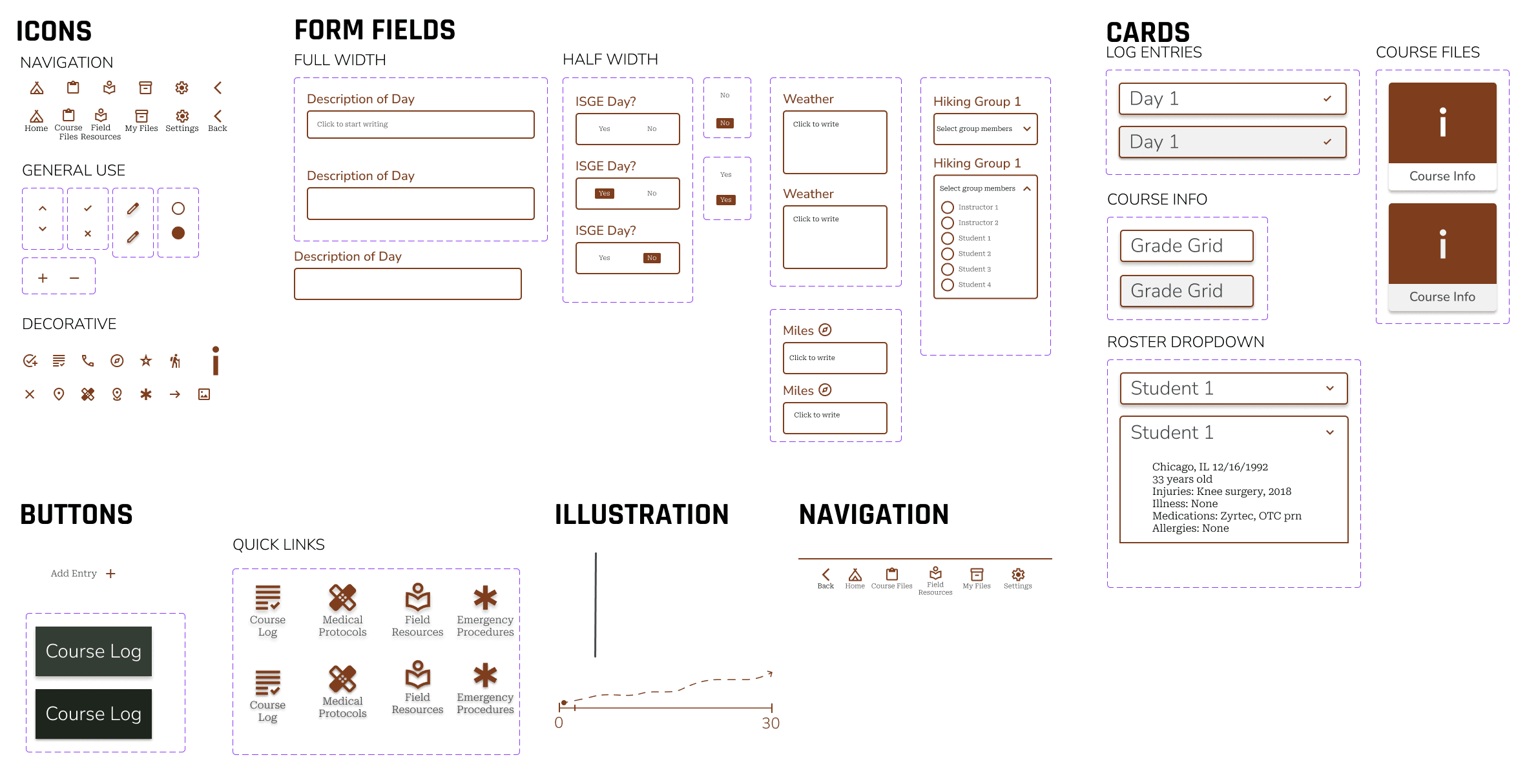
Styles
I loved putting together the components for this app. I developed a list of components from the low fidelity wireframes and organized components starting with the smallest element of each nested component. This made the process of building components and, subsequently, high fidelity wireframes smooth and efficient. I knew my basic building blocks and how to put them together.
Similarly, when usability test results showed needed changes, I was able to quickly and easily update components to match user needs.
USABILITY TESTING
Plan and Method
Usability testing for the application had two functions. One was to understand how well the course log entry form worked and the other was to test the information architecture. In hindsight, I wish I had done tree testing for the IA after developing the initial site map. However, I felt confident that usability testing of the prototype could give me the information I needed given that I had mimicked the way the analog system was currently organized.
I used a remote based unmoderated test in Lyssna that had both open ended questions and specific scenarios. I recorded the time it took to complete the task, completion rate among all users, and recorded screen and facial expressions.
Iterations
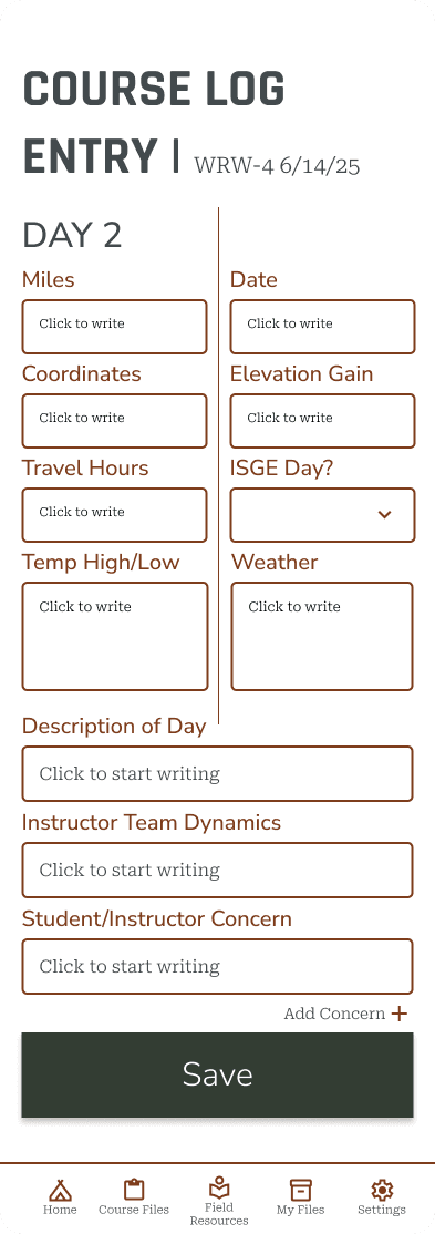
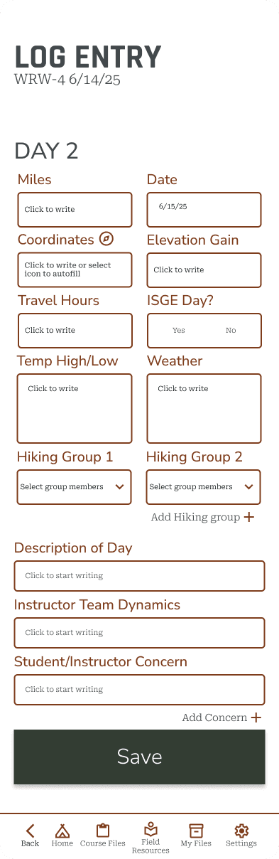
I made the following iterations to the key screens:
Autofill day and date of course log
Indicate way to auto fill UTM coordinate
Switch ISGE field to selection of yes or no (remove drop down)
Add in section for hiking groups allowing for additions of more hiking groups and each addition is a drop down of the roster where you can select student and instructor names
Add a “back” icon to bottom navigation
Link course log entry to day on home screen
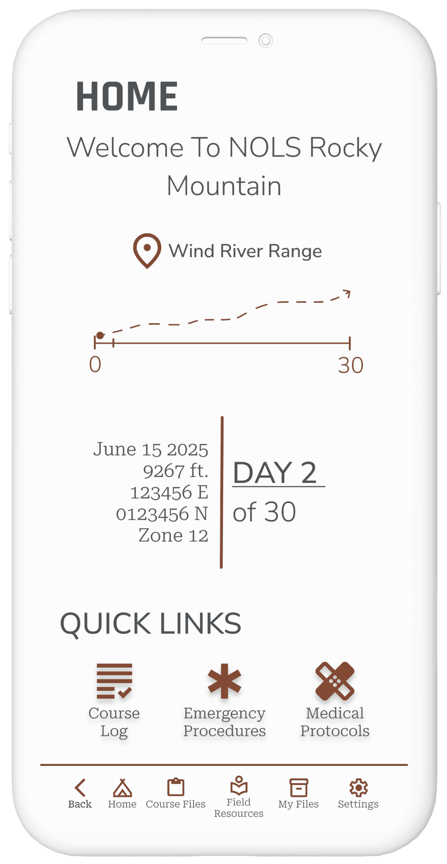
See the most significant changes in the Log Entry screen.
FINAL PROTOTYPE
Reflections
This project brought together all the skills I've been practicing and allowed me to implement them in a more efficient and confident way. Throughout the process, I recognized significant growth in both my technical abilities and design process. Spending more time on low-fidelity wireframes and planning out a UI kit and component system really paid off, making both the digital mockups and prototype process faster and the iteration process smoother.
Research Approach & Key Insights
In hindsight, tree testing after the site map development would have helped validate the information architecture in the app, especially with an app that contains so much information. I adapted my process and structured one usability testing scenario specifically to understand how the information architecture works for users. This adaptable approach provided valuable insights into whether users could intuitively navigate the system's organizational structure. Moving forward, I will consider IA testing methods earlier in the process to help validate structural decisions before investing time in higher-fidelity work.
Design Challenges & Growth
Creating a comprehensive component list before building the prototype proved invaluable. Breaking designs down into the smallest possible atomic components gave me much greater flexibility during prototyping and iterations. This systematic approach made the prototype-building process significantly faster and allowed for more efficient adjustments based on usability testing feedback.
The methodical preparation phase—spending extra time on low-fidelity wireframes and component planning—created substantial efficiency downstream. I can see both incremental and significant progress in my skills, particularly in how thoughtful planning compounds into time savings and quality improvements later in the design process.
Outcomes & Future Directions
I successfully created an internal tool that transitions field documentation from analog to digital while maintaining enough familiarity with existing systems to ease user adoption. The design harnesses the power of digital documentation for greater ease of data collection and synthesis.
Next steps include building the application for field testing with iterative refinements based on small-batch user feedback, and updating internal workflows for receiving digital paperwork to fully take advantage of digitization benefits.
CASE STUDIES
lones.amy@gmail.com
2026
Amy Lones