NOLS
Moving the student equipment list from Google Docs into the internal student dashboard.
Role | UXUI Designer
Client |NOLS
Tools | Figma, Lyssna, Google Suite

OVERVIEW
Background
NOLS recently underwent a website transition, allowing for more flexibility and ease of website management. This transition, completed in July 2025, allows the creation of new features and better user experience for current and potential students. NOLS wants to move the equipment lists for each course from Google docs to the website.
Problem
NOLS students sometimes struggle to prepare confidently for their courses due to unclear equipment guidance. This uncertainty leaves students either purchasing gear they don’t actually need, arriving underprepared, or feeling anxious about their readiness—all of which could be prevented with better pre-course communication and decision-making support.

RESEARCH
Methods
For research methods I conducted a competitor analysis and had the opportunity to talk to students in person after they had started their course from two different types of semester courses. Semester courses have multiple field sections specializing in a specific activity per section like rock climbing, whitewater rafting, canyoneering, or backpacking. NOLS peak season is summer when courses are typically one field section and focused on backpacking. We extrapolated learnings from the more intensive semester experiences with the equipment list to apply concepts to simpler course types.
Interviews
6 user interviews
1 stakeholder conversation
Goal: understand benefits and challenges of current digital and analog documentation processes
Competitor Analysis
How is information presented on equipment lists from other outdoor education and adventure travel organizations?
Analysis
Synthesis

Synthesis
Findings
Most people don't need to see the equipment list before they enroll on the course
Students face three primary challenges:
Understanding which optional items are truly necessary for their specific course
Identifying cost-effective alternatives without compromising quality
Accessing instructor expertise to answer nuanced questions before the course begins.
Users want a variety of interaction options in the equipment list: filter, sort, print, check boxes, links
INSIGHTS
User Archetypes
I used archetypes based on my research findings to keep the user in mind as I started to hone in on different solutions. Since I was only able to interview semester students, I also incorporated information I gathered about students on other course types to make sure I was incorporating a wide range of users into the archetypes.
Experienced Student
Core Needs
Equipment list that is easy to understand and simple to use
Information about needed equipment and whether they can purchase or rent any additional equipment needed
Behaviors
Packs from own experience and has gear that they use regularly
Prints out list to check items off - prefers to have a paper copy
Pain Points
Deciding what gear they should bring if what is on the equipment list differs from their usual systems.
May have highly individualized preferences or questions about equipment
Highly Organized Adult
Core Needs
Organized systems to accurately track equipment needs
Ability to organize according to their own needs and preferences
Information about needed equipment and instructor recommendations
Behaviors
May create own system based on original equipment list
Tracks different stages of the equipment gathering and packing process (inventory, acquisition, rental, packing)
Wants to make sure they don’t miss anything
Pain Points
Cost is a consideration and may impact quality of gear
Wants to know what items have to be high quality and where they can find lower cost alternatives
Newer Student
Core Needs
Simple information system that they can share with parent or guardian
Understanding of what gear they need and why
Clear guidelines on what they can get from NOLS either to buy or rent
Behaviors
Gets many items at NOLS either buying or renting
Gets everything on the equipment list, including optional items
Pain Points
Optional items may be discouraged by instructors once students arrive on campus
Wants to know what instructors recommend ahead of time to know what to actually buy or rent

Prioritization
I prioritized features that would make the list more functional to use on a desktop or mobile. I embedded features that users wanted or found ways to create by printing the list (ability to check things off or highlight/color code for organization) or recreating it in excel (for filter and sort functions).
The design allows NOLS to scale up functions as they revamp their online store and explore whether its possible to put location store inventory online.
CONCEPTS
Task Flows and User Flows
Task and user flows went through several iterations from initial flows to the built prototype. Developing wireframes helped me continuously refine user and task flows to what made the most sense for the user. It was a built in test - do the task flows make sense once we convert them to screens? Do I see more information about a user flow that wasn't initially documented?
User flows especially benefited from clarification of user decision making points. In this case, I could represent all task flows within one user flow, illustrating several possible pathways for the user depending on their goals.

How might we provide clear, comprehensive equipment guidance that helps students understand requirements, make informed purchasing decisions, and identify cost-saving opportunities before the course begins?
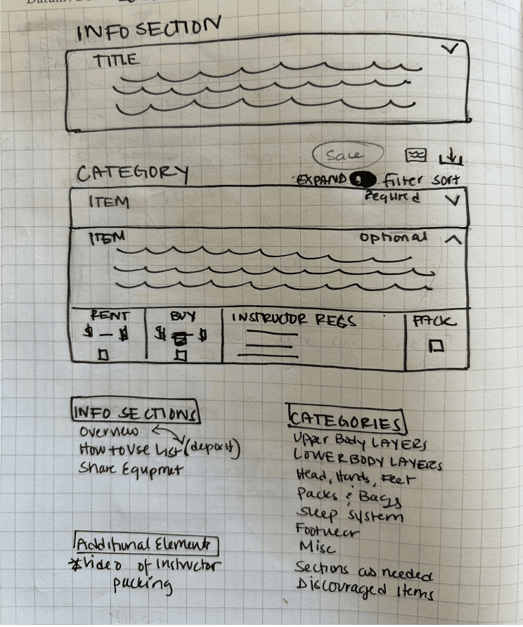
Low Fidelity Wireframes
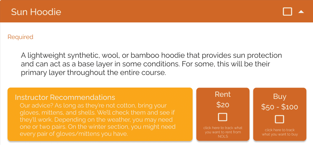
I went through a couple of iterations for low fidelity wireframes. I initially sketched out just the dropdown component. I knew that drop drowns were the way to help users moderate the amount of information they saw all at once. Sketching allowed me to explore the concept and then I outlined three different states for the equipment list. images are as follows:
Equipment dropdown ideation
Equipment list with all dropdowns closed
Equipment list with one overview dropdown open
Equipment list with one equipment dropdown open


PROTOTYPING
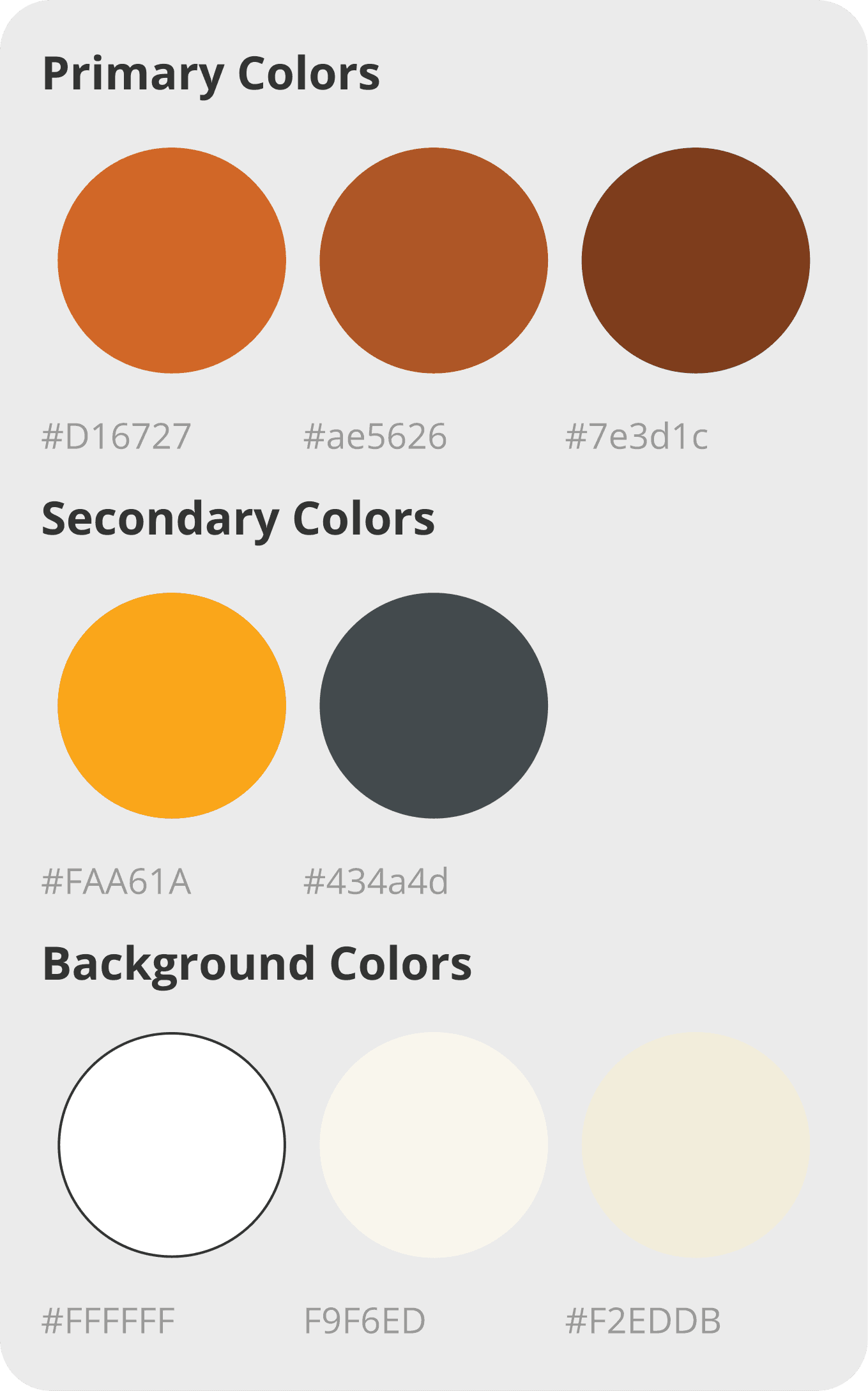
Color
Since this client had existing brand colors and branding guidelines, I had a starting point to work with. The client recently underwent a brand refresh, which allowed for a cleaner visual interface.
I wanted to use the primary brand color - mud - in a distinctive way but also knew that it would only meet WCAG AA contrast guidelines with large white text over the mud background. Using mud for the header allowed me to then use a higher contrast text and background combination for smaller body text.
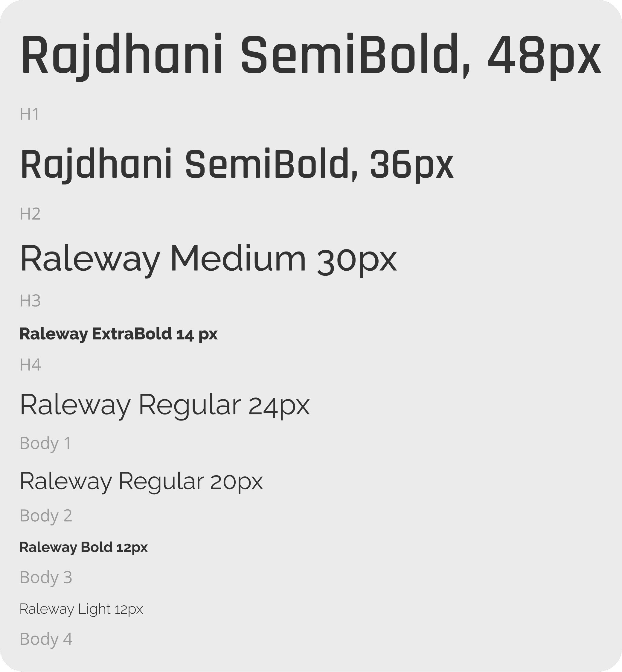
Typeface
The client also had proprietary typefaces for print materials. They had some guidelines for web use, but I wanted similar variety for headers, sub-headers, and body text to the print guidelines. Along with some of the digital typefaces, I found similar google typefaces to the proprietary print typefaces and created styles that spoke to the brand, but that were more accessible on the web.
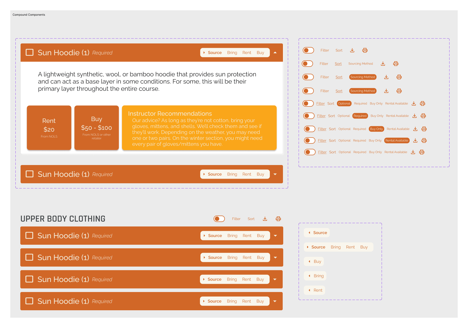
Components
I applied these styles to several components. Since I was not testing navigation to any other part of the site, I prioritized building components for the elements I was going to test. To speed up the process, I used screenshots of the upper navigation and the footer since they did not require functionality to get quality usability tests.
USABILITY TESTING
Plan and Method
Due to time, location, and cost constraints, I opted for a minimal tool set for conducting evaluative research. I watched users while they navigated the screens and tasks. I took notes and timed manually. While this approach was challenging and made sorting through notes and takeaways more difficult compared to moderated testing on an online platform, it was a great learning experience that will allow me to be flexible and work with whatever resources are available in the future. I tested three scenarios:
Scenario 1: Selection Task
Goal: User selects which items they need to buy and which items they need to rent from NOLS
Scenario 2: Sort Function
Goal: User selects and utilizes the sort function.
Scenario 3: Filter and Print
Goal: User utilizes the filter and print functions.
Iterations
The primary iteration was redesigning the header on the equipment drop downs. In order to reenvision the header I sketched and annotated two low fidelity options.

Equipment Dropdown Changes
I landed on several changes to the Equipment Dropdowns. (moved the checkbox to the left of the titles, and added sourcing status and required/optional indicators to the header bar. I also enhanced the expand and collapse controls with the ability to expand and collapse all elements by section in addition to all elements on the page.

FINAL PROTOTYPE
Reflections
This project provided invaluable experience working with a real client from start to finish, taking a design from concept through implementation. Throughout the process, I developed significant expertise in building complex component systems with multiple layers of auto layout and nested components—learning that creating the smallest possible atomic components gives you much greater flexibility down the line.
Research Approach & Key Insights
User interview revealed a surprising pattern: many users exported the document rather than using it digitally. They either printed the list or transferred the information into Excel or Google Sheets to better organize their process. I was particularly struck by how many users chose the spreadsheet route and how similar their organizational processes were to one another.
Conducting research directly with people who have used the tool proved extremely valuable and demonstrated how much more useful insights are when gathered firsthand. I experimented with a different usability research model, using a minimal set of tools—simply watching users complete tasks and taking notes. While this approach made sorting through notes and takeaways more difficult compared to moderated testing on an online platform, it was a great learning experience that will allow me to be flexible and work with whatever resources are available in the future.
Design Challenges & Growth
I appreciated working on a project where I had substantial background and subject matter expertise. This knowledge allowed me to understand both the user perspective and the constraints of internal workflows, making me more effective in my design decisions.
Building a more complex prototype presented interesting problem-solving opportunities. However, I encountered prototyping limitations—both from Figma's capabilities and my own skill level—and was forced to compromise on the prototype's complexity. Prototyping became the main focus of the project. Even though there's technically one screen, it contains many interactive components. Getting all the components to work together with the right auto layout was challenging. I don't yet have advanced prototyping skills in Figma, so I had to adjust my expectations and functionality to match my current abilities. I recognized that increasing functionality would impact my timeline, so I focused on creating a component that was still an effective usability testing tool.
Outcomes & Future Directions
The primary goal was achieved: increasing usability and available features by moving the equipment list from a Google Doc into the enrollment dashboard.
Next steps include developing internal workflows for updating and maintaining equipment lists, and adding features such as affiliate links and online inventory for NOLS location stores so students can see what each location offers to buy and rent.
CASE STUDIES
lones.amy@gmail.com
2026
Amy Lones